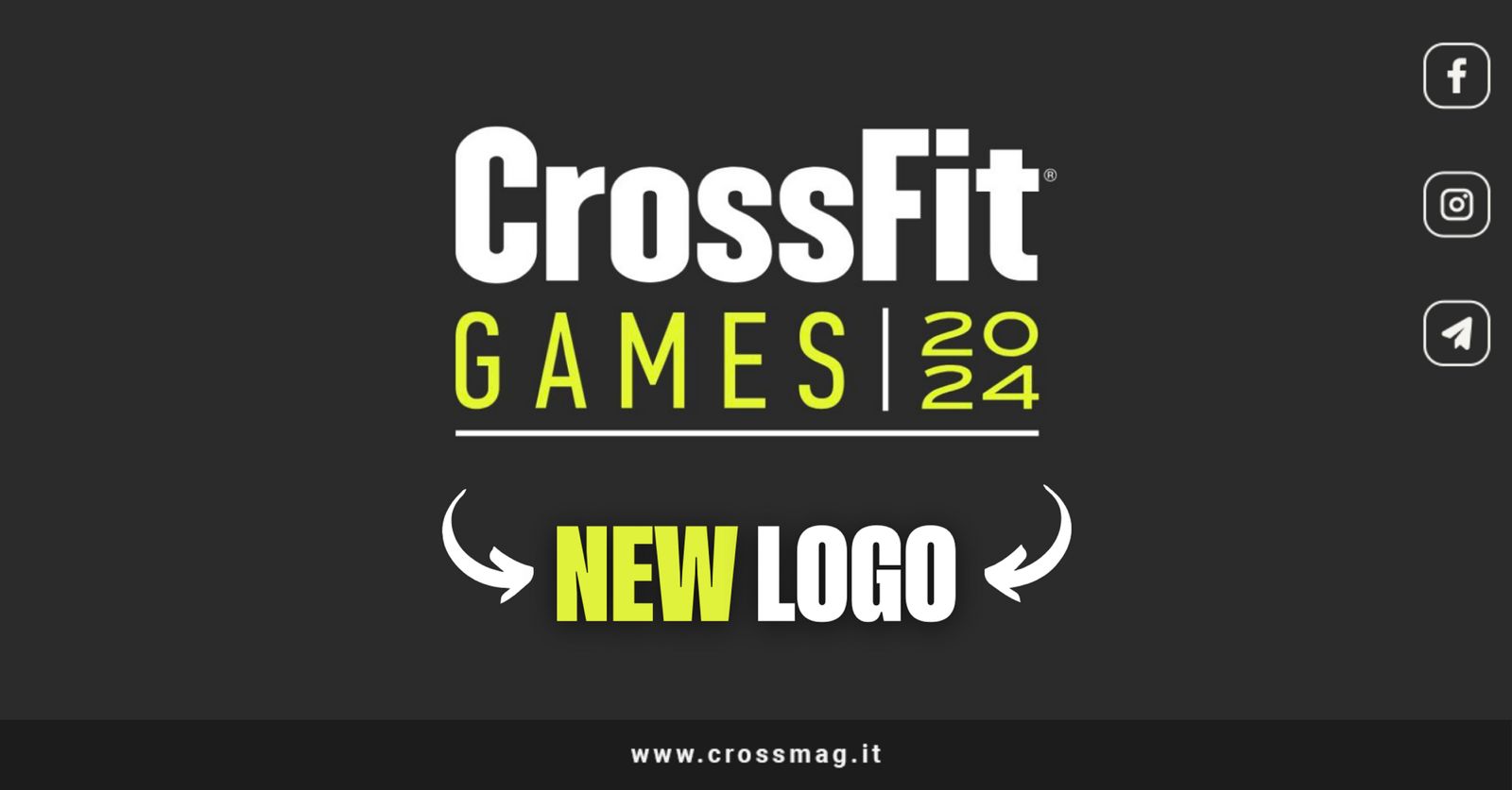
At the beginning of the 2024 season, in the world of CrossFit® there is an air of renewal which affects us closely. There presentation of the new CrossFit® Games logo is not just news: it is a statement, a symbol of change that speaks directly to us.
Far from being a simple marketing move, this new logo reflects a profound change in the culture of CrossFit® which you will probably resonate with force in our community.
Here is the official announcement:
Visualizza questo post on Instagram
Index
The most significant changes
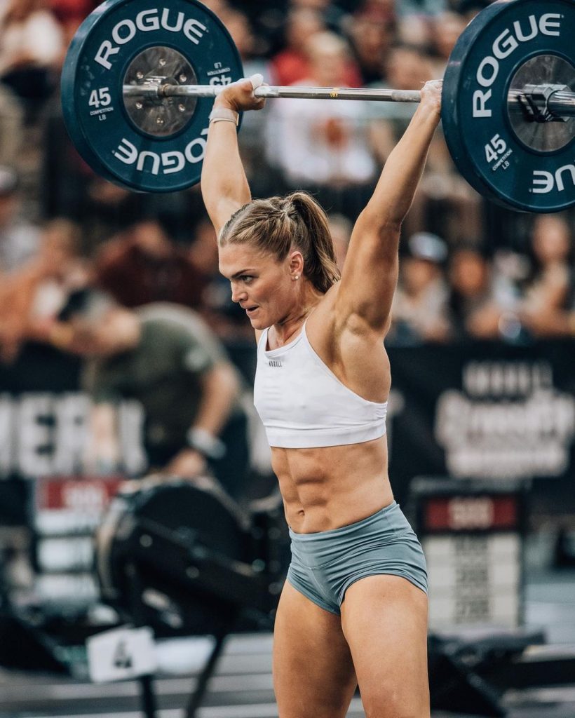
Il separation from NOBULL and the choice not to include a new main sponsor in the logo is a bold statement. In an age where branding and sponsors dominate the sporting landscape, CrossFit® stands out.
As enthusiasts and practitioners, we appreciate this move towards authenticity and independence. CrossFit® returns to its roots, putting the athlete and the community back at the center, not the brand.
Erick Diaz-Soto, creative artistic director of CrossFit®, wanted create a logo that talks about protection and movement, two pillars of our sport.
The introduction of a single color breaks with the past, injecting vitality into a symbol that will accompany us in every challenge and every competition. This new emblem is not just for elite athletes, but for all of us who work in the pits every day.
Here are the words of Diaz-Sotto:
“For this project we broke new ground by creating an independent logo, a coat of arms symbolizing protection and movement and a modular system that can be applied to different types of media and platforms.
We also introduced monochrome color, making the logo more vibrant and dynamic. We are proud of our work and hope it inspires, strengthens and motivates the CrossFit ® Games community and athletes as we enter a new year and continue our collective commitment to health and fitness.”
In short, this logo is more than an aesthetic symbol: it is a reminder of the commitment to fitness, strength and community. It's a I invite you to look forward, to innovate, to challenge the status quo. In CrossFit®, we are used to pushing ourselves beyond our limits, and this logo is the visual reflection of that philosophy.
What do we think?
Yes, the new 2024 CrossFit® Games logo and recent changes they bring with them challenges, both in terms of marketing and acceptance in the community.
On the one hand, there is a profound meaning in this renewal: CrossFit® is trying to evolve while remaining faithful to its core values.
However, we cannot ignore that there has been some discontent in our community. The recent increase in the price for affiliates, the obligation to have a coach with L1 certification, the modification of location of the Games, and the separation of the age group and adaptive categories from the main event have sparked debate and concern.
These changes, including the new logo, are seen by some as a step away from CrossFit®'s roots and traditions.
In this context of change and uncertainty, our role as a magazine is to reflect the diverse voices of the CrossFit® community. We want to open a dialogue: what do you think of these news? Are we really faced with a positive evolution of CrossFit®, or do these changes represent a departure from the values that have made this sport great?
Make yourself heard, crossfitters!